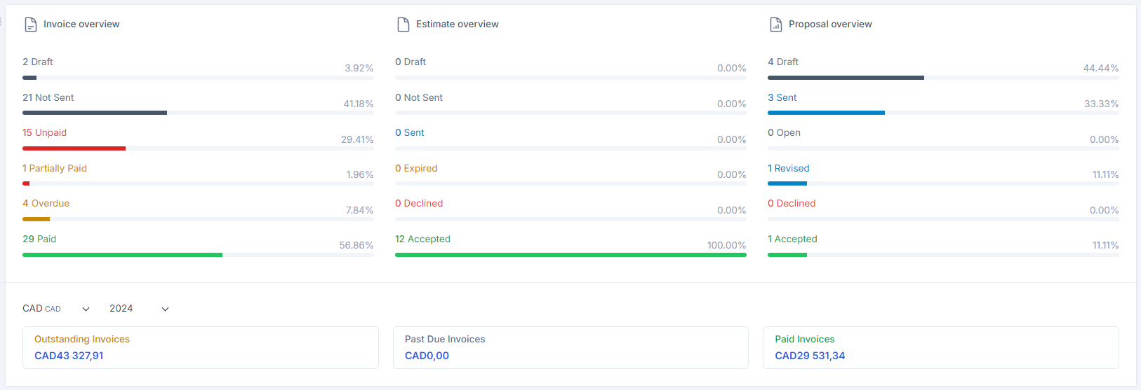
In Radius CRM, a "performance chart" is a visual tool used to represent and analyze the performance of sales, customer service, or other key performance indicators.
Here is what it can involve:
1. Visualization of performance indicators: The performance graph often displays indicators such as turnover, number of sales, conversion rate, customer retention rate, response time to customer service, etc. These indicators are essential for evaluating commercial and operational performance.
2. Time Tracking: Performance charts typically show how these metrics evolve over time, allowing you to spot trends, seasonal variations, or changes in performance.
3. Comparisons and analyses: These charts also allow you to compare different time periods (e.g. month by month or year by year) or different teams/industries to identify areas for improvement or success.
4. Intuitive visualization: Using graphics such as lines, bar charts or interactive dashboards, you can quickly understand the overall or specific performance of a team, sales representative or of a product.
5. Decision-making support: Performance charts help you make informed decisions by identifying areas where corrective actions or strategic adjustments are needed.
In summary, a performance chart in Radius CRM is a key tool for monitoring, analyzing and optimizing business and operational performance, providing a visual representation of data and insights essential for effective customer relationship management.